Just a quick note to feature this beautiful beadwork illustrating global warming in North America.

By Peggy Dembicer on flickr.
What a beautiful piece of artwork to bring attention to this threat to our global ecosystem.
Posted in Art, Craft, Environment, Geography, global warming, Maps on March 9, 2009| 2 Comments »
Just a quick note to feature this beautiful beadwork illustrating global warming in North America.
By Peggy Dembicer on flickr.
What a beautiful piece of artwork to bring attention to this threat to our global ecosystem.
Posted in Environment, Geography, Maps, Ocean, tagged climate change, coastal, holland, imagery, netherlands, satellite, sea level rise on November 7, 2008| 1 Comment »
There was an interesting article in the New York Times today about a plan by the Netherlands to build a tulip-shaped island off-shore to help protect its coast from sea level rise. Here is the photo that appeared:

From the article:
The idea, Mr. de Boer went on, would be not only to gain land and protect the coast, but also to showcase Dutch engineering skills. At the same time, an island could be an energy powerhouse, shaped like a ring to create so-called blue energy by using the contrast of fresh and salt water to generate electricity, or the ebb and flow of the tides. Wind turbines could also produce even more energy, he said.
A green project all-around? I’m skeptical, but the concept is quite interesting on many levels.
Posted in Art, Books, Environment, Fun, Geography, Maps, The Stuff of Life, Urban Nature, tagged architecture, Center for Land Use Interpretation, design, landscape, non-profit organizations, Photography, transit, trash on August 4, 2008| 2 Comments »
Here is a group I want to find out a lot more about: The Center for Land Use Interpretation. I discovered them from a little sidebar in the New York Times on the Hudson River which mentioned their new book, Up River: Man-Made Sites of Interest on the Hudson from the Battery to Troy. According to their website, the CLUI:
is a research organization involved in exploring, examining, and understanding land and landscape issues. The Center employs a variety of methods to pursue its mission – engaging in research, classification, extrapolation, and exhibition.
But that seems to be putting it mildly. They seem to have a fascination for all the many ways that man and landscape intersect for good or for bad. And their medium is based in the visual. They have many other books, online features, newsletters (going back to 1995!), and exhibitions on everything from trash to parking spaces. I’m going to have to spend a lot more time checking them out.
Posted in Environment, Geography, Maps, Video, tagged carbon, carbon emissions, emissions, Maps, perdue, perdue university, project vulcan, Video on April 28, 2008| Leave a Comment »
In the categories of maps and carbon emissions, I present Project Vulcan (and it has nothing to do with Star Trek, except perhaps some inspiration in naming). This is a project at Purdue University to distill information about carbon emissions by economic sector (power, industry, transportation) into useful visualizations. It is funded by NASA and DOE (I wonder if the administration knows about this heresy).
Too lazy to check out the website? Here is a video that summarizes the work:
Here’s a graphic they created of the top 20 carbon emitting U.S. Counties (I find it morbidly humorous that #11 is Carbon, PA):

Posted in Maps, tagged a-train, atlanta, biking, google, google transit, Maps, public transportation, transit, trip planning, urban, walk, walking on April 2, 2008| Leave a Comment »
I made a discovery today that makes me so incredibly happy. For months, I’ve been wondering why Atlanta can’t get with the program and submit its public transportation data to Google Transit. I still don’t know why it hasn’t happened, but now we have something better: A-TRAIN Atlanta Transit/Bike/Walk Trip Planner. This site is so smart it can tell you how long it will take you to get from point A to point B using whatever mode or combination of modes you choose, and it even takes into account topography and lets you change your personal walking or biking speed so you can get an accurate reflection of how much time you will need. So. Incredibly. Awesome.
Posted in Citizen Science, Environment, Geography, Maps, Urban Nature, tagged envirionment, green living, green map, mammaking, Maps, tourism, urban environment on March 5, 2008| Leave a Comment »
I have been waiting to post on this for over a week while I became inspired to add some value to simply linking to Green Maps Around the World, but I really can’t add anything to their own self-description:
Green Map ® System promotes inclusive participation in sustainable community development around the world, using mapmaking as our medium.
GMS supports local Green Mapmakers as they create perspective-changing community ‘portraits’ which act as comprehensive inventories for decision-making and as practical guides for residents and tourists.Mapmaking teams pair our adaptable tools and universal iconography with local knowledge and leadership to chart green living, ecological, social and cultural resources.
Over 300 vibrant Green Maps have published to date, and hundreds more have been created in classrooms and workshops by youth and adults. Both the mapmaking process and the resulting Green Maps have tangible effects that:
- Strengthen local-global sustainability networks
- Expand the demand for healthier, greener choices
- Help successful initiatives spread to even more communities
Green Map System has been developed collaboratively since 1995, and is now active in 400 cities, villages and neighborhoods in 50 countries. GMS and its network of regional hubs and community-led Green Map projects share the award-winning outcomes through their online profiles, blogs, Green Map books and media productions, workshops and other public presentations.
This website is the gathering point for both the makers and users of Green Maps, and offers many inspiring resources including our new organizational booklet to anyone interested in a sustainable future.
Online since 1995, GreenMap.org was re-launched in May 2007, with an exciting new presentation-collaboration-resource center for Mapmakers (we named this content management system the Greenhouse for its ability to cultivate and preserve our diverse ‘garden of Green Maps’). At that point, there were 400 registered Green Map projects from 51 countries. Find a List of all at About the Mapmakers along with more background. In the continually expanding Maps section, find fresh, new locally-authored illustrated profiles and Green Maps from all parts of the world!
Posted in Energy, Environment, Geography, Maps, tagged Appalachia, Appalachian Mountains, coal, electricity, Kentucky, mountains, mountaintop removal, Tennessee, Virginia, West Virginia on February 25, 2008| 2 Comments »
If you haven’t heard of mountiantop removal, you are about to be in for a shock. Many people do not realize that a large portion of our electricity still comes from coal and that the preferred method for mining coal today involves the literal removal of the tops of mountains in the Appalachians. This method is extremely damaging to the forest, rivers, and to communities. I read an excellent book about the process called Lost Mountain by Erik Reece last year, which I highly recommend.
A non-profit group called Appalachian Voices has created a fantastic mapping application that you can use in Google Earth or on their website to view images of the destruction and now to figure out how you are directly connected to this awful process. Robert F. Kennedy has written about the website more eloquently as have several other scientists/activits/authors here.
Posted in Environment, Geography, Maps, Urban Nature on September 27, 2007| 1 Comment »
via GeoLounge (check out this link to see some sample maps):
Haringey Council (located in London, England), is using heat mapping to highlight energy inefficient homes within their jurisdiction. The city council hired an aircraft fitted with a thermal imager to fly over all the homes in the jurisdiction to capture heat loss. The houses were then color coded based on a heat loss scale with bright red for the highest level of heat loss and bright blue indicating the lowest loss of heat. All of the data is available online for the public to see. Any visitor to the Haringey Interactive Heat Loss Map can hover their mouse over individual homes to get the address. The hope of the council is that a public display will shame some homeowners into insulating their homes to bring down heat loss. The original thermal mapping was down back in 2000 but new flights were taken this past March and now a 2000 and 2007 version of the heat loss map are available from the Home Heat Loss page of the Haringey Council web site. If the side by side comparison (see below) is any indicator, the heat loss map is making a difference in the reduction of energy loss in at least some of the homes. The mapping and processing was done by www.hotmapping.co.uk.
Posted in Fun, Geography, Maps, Photography on September 27, 2007| 1 Comment »
USGS has a neat collection of satellite images constituting Earth as Art, which you can also add as a Google Gadget to your iGoogle page or web site.

Image Name: Karman Vortices
Image Date: September 1999
Image Source: Landsat 7
Scale: 1″= 4.3 miles(6.9km)
Description: Each of these swirling clouds is a result of a meteorological phenomenon known as a Karman vortex. These vortices appeared over Alexander Selkirk Island in the southern Pacific Ocean. Rising precipitously from the surrounding waters, the island”s highest point is nearly a mile (1.6 km) above sea level. As wind-driven clouds encounter this obstacle, they flow around it to form these large, spinning eddies.
Posted in Environment, Geography, Maps on August 1, 2007| 2 Comments »
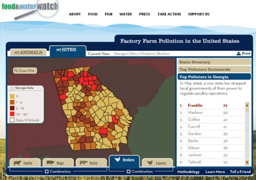
Ever wondered about factory farming in your neck of the woods (or elsewhere?) Here is an interesting site with a nice web mapping application to help you find out about the impacts of factory farming anywhere in the U.S.: factoryfarmmap.org